New Design for a Dentist's Website
We changed the design using DeepSeek, and it is ready for conversions.

Workflow
Briefing
Collected client’s goals, audience, and key features.
Development
Built frontend, backend, and integrated content.
Launch
Deployed to live server, tested, and went live.
The Challenge & Solution
We present the new website design for a dental clinic. As usual, we share project details with the client’s permission. All names, addresses, and contact information are fictional. All images and videos are generated as temporary content.
A representative from the dental clinic reached out to us asking for a website redesign. The previous site, used since before the pandemic, was built by non-professionals but still fulfilled its purpose—it had a high client conversion rate. As the clinic grew, its marketing and branding strategies evolved, and with the addition of a marketing specialist, there was a need to update the design.
We received references and requests from the client:
- More space;
- Soft, muted tones;
- Emphasis on green colors;
- Larger information sections.
We began working on the project. As the primary tool, we used the DeepSeek V4 Pro neural network, which we consider one of the best for design development, while entrusting the technical implementation to GLM 5.2. The project was completed in three days. After successful approval, the website went live with only minor adjustments.
Hero Section
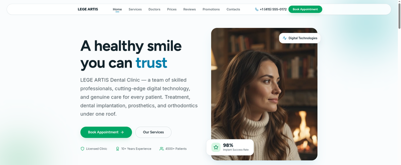
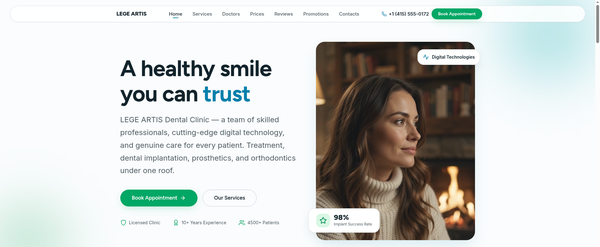
The first screen builds trust through a clean design and focus on key benefits. It features a clear headline, intuitive navigation, and contrasting call-to-action (CTA) buttons. The photo is enhanced with stylish “floating” UI elements that highlight the clinic’s technological sophistication and high procedure success rate. Social proof badges (experience, number of patients) are also included.
Services Section
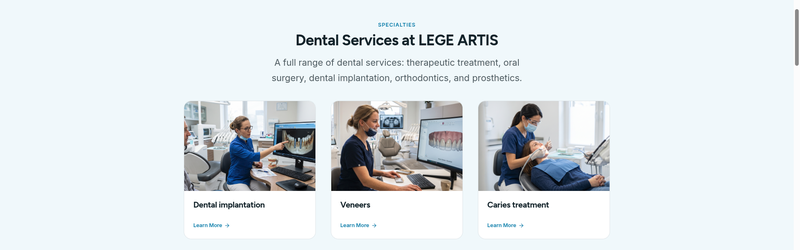
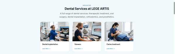
The services section is designed as a card-based layout with rounded corners, creating a soft and friendly interface. Each service is accompanied by a themed illustration or high-quality photo to improve information readability.
Team Section
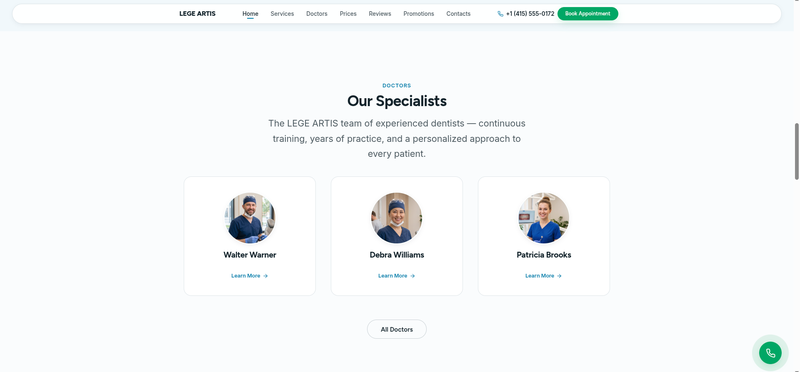
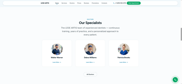
Doctor profiles are presented in a minimalist style: a portrait photo, name, specialty, and a link to detailed information. The use of white space prevents the interface from feeling cluttered, while a fixed CTA button in the lower right corner provides quick access to contact details.
Statistics Section
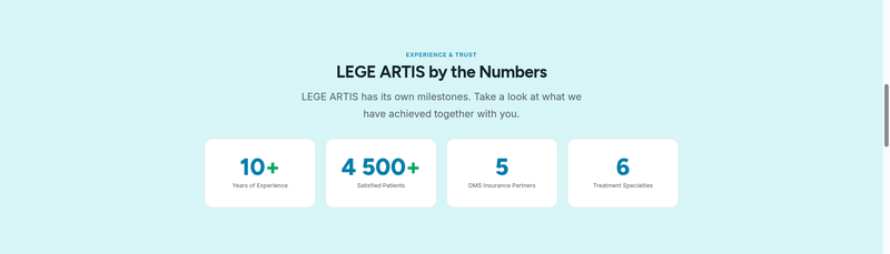
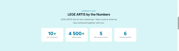
This informative section displays key metrics through large, easy-to-read infographics. Contrasting color accents (blue and green) on a light background draw attention to important figures, such as years of experience and the number of patients. This is an effective UX technique to build trust.
Patient Reviews
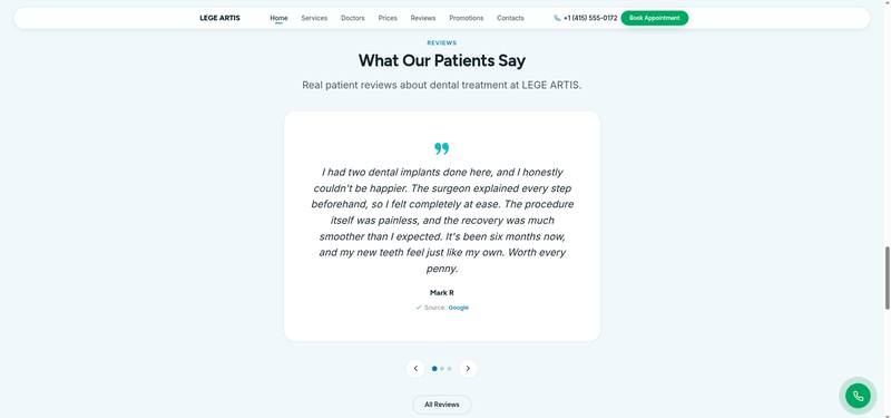
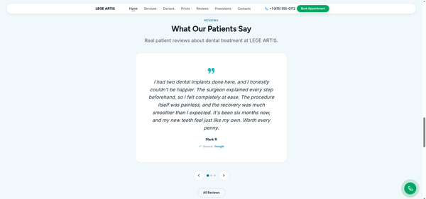
A social proof section focusing on real user experiences. Review text is displayed in large fonts on a stylish minimalist card. Stating the source enhances credibility, and a clickable link allows visitors to view the original reviews. A convenient carousel navigation is implemented to save space on the page.
Contact Section
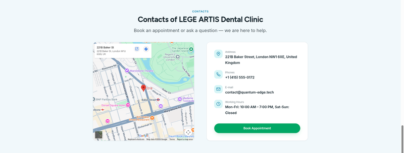
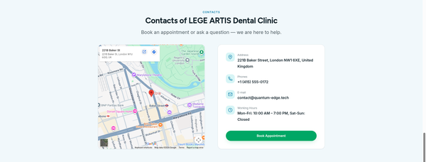
The final screen is divided into two sections: a map with a location marker and an information card. Address, phone numbers, email, and hours of operation are aligned and accompanied by icons. The section ends with a final CTA button.
Dental site gallery